Prototype
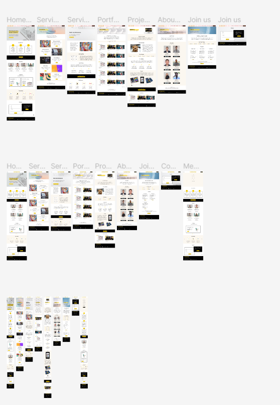
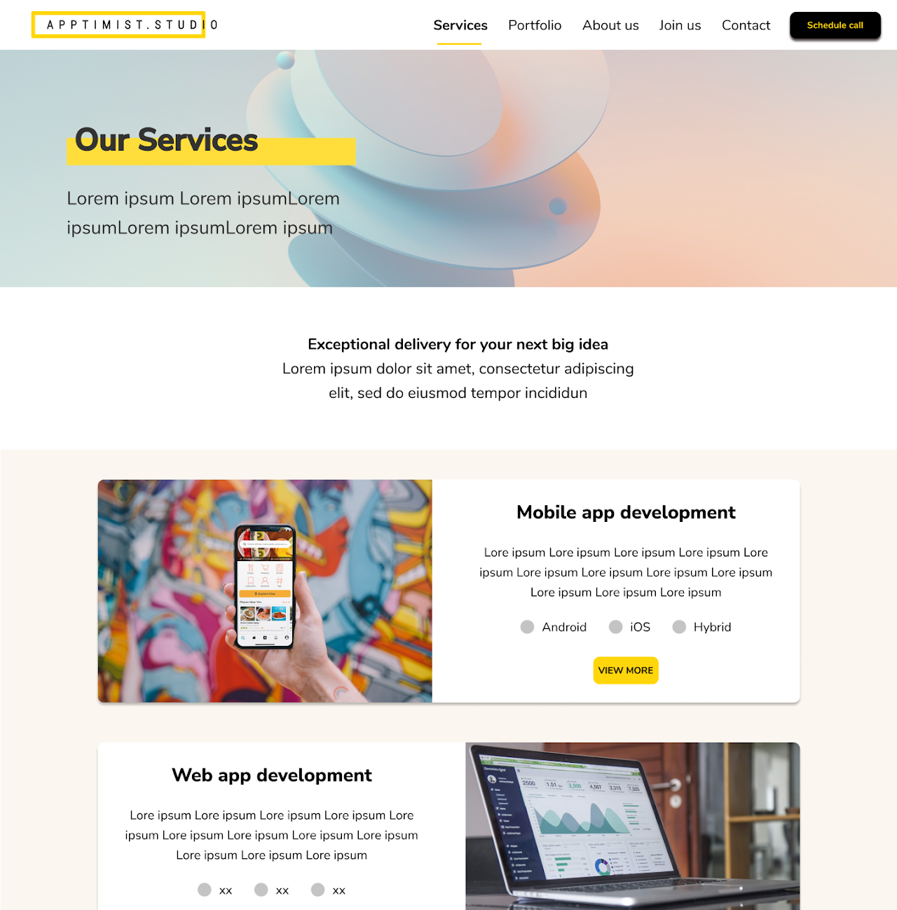
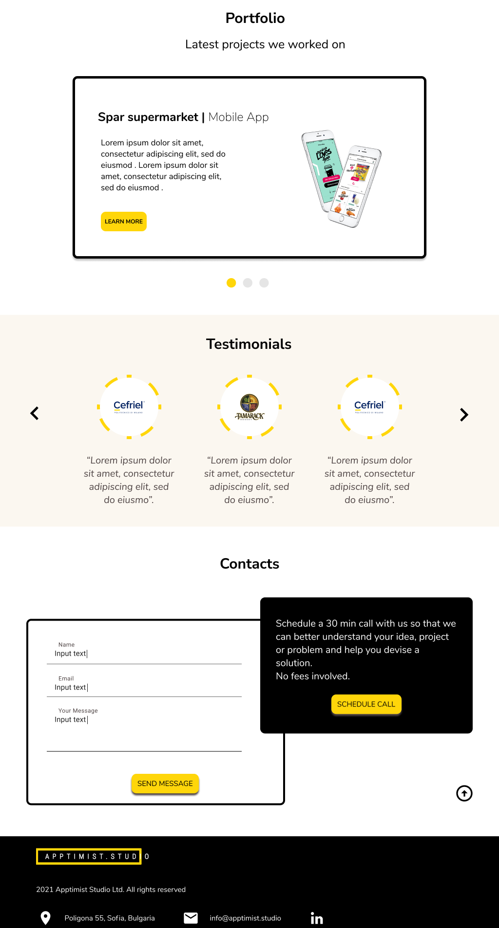
Combining the style guide with the direction outlined through paper wireframes, I then created mockups in Figma. It was important to showcase through the homepage the depth and the width of the company's positioning and offering. I therefore proposed a scrollable homepage containing the most essential information so that a user can comprehend the nature of the company in around 15 seconds.
To make the prototype accessible, I ran color contrast testing and adjusted the colors to comply with the Web Content Accessibility Guidelines. Bearing in mind the responsiveness of the website, I designed the mockups for desktop, tablet and mobile devices.


