Paper and digital wireframes
Paper wireframes
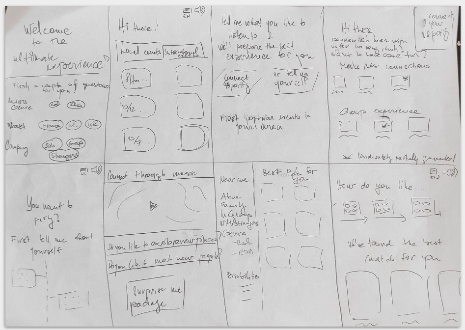
I started the process of designing the app by making quick paper iterations for the application, the intent of which was to design a streamlined experience of purchasing an event package for busy professionals.
Digital wireframes
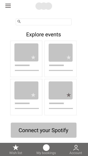
After the initial paper wireframes, it was time to create simple digital ones and start testing the assumptions with the users.
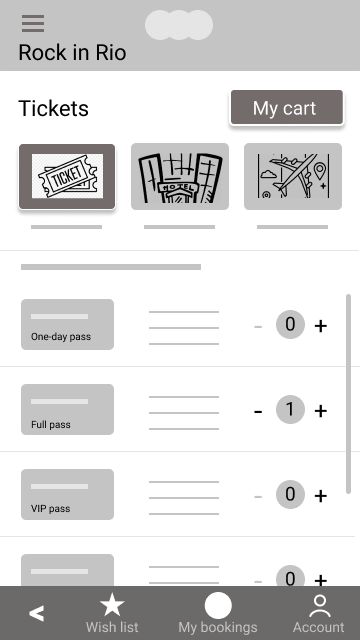
Every event will have three tabs users will be able to choose from, namely, Tickets, Accommodation, and Travel.
I then conducted the first usability test with 6 participants to test the user flow and confirm the hypothesis.
I proceeded to create low-fidelity digital wireframes, creating a user flow around completing an order within the app.