High-fidelity prototype
Acting on the findings of the user testing of the low-fidelity prototype, I changed the initial designs to reflect the following insights:
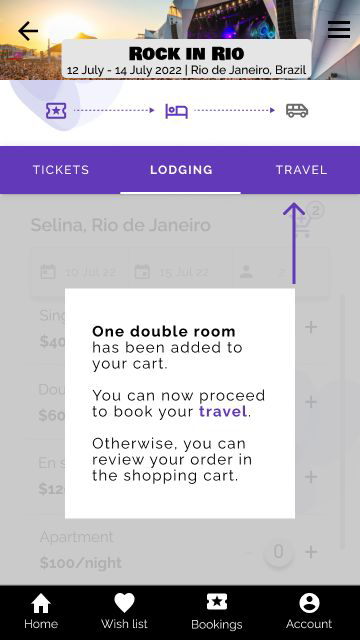
- Users prefer to have a choice whether to continue to add more items in their cart or go straight to the shopping cart. I implemented this feedback by adding two buttons: The first one takes a user to the shopping cart, while the second to the travel page.
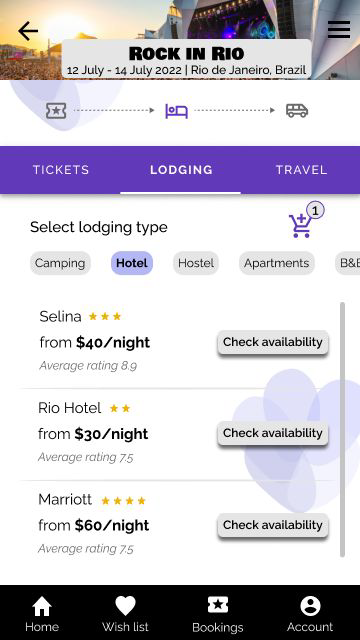
- Users voiced that they wanted to see the type of hotel listed on the app, therefore I added in their star rating for easier navigation.


