Paper and digital wireframes
Paper wireframes
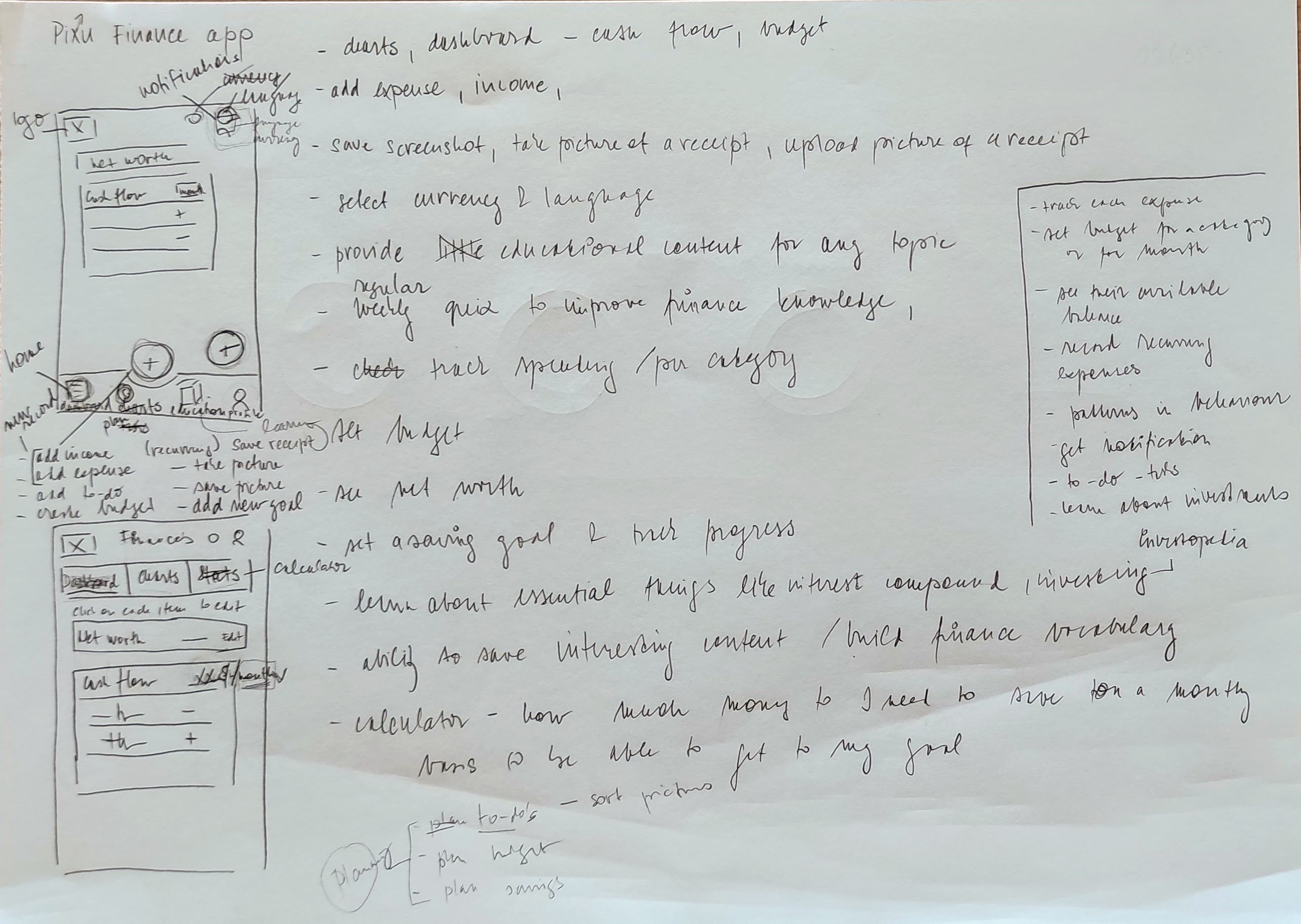
With a clear problem statement and crazy 8's exercise, I then proceeded to list the main functioning of the application. These all then informed the direction I have taken with sketching the paper wireframes.

Next in line was to make a paper wireframe for most of the screens. It was important to iterate on different version to get the wireframes right.
Going back to the user pain points, I identified that the app does need to only track the expenses but also allow users to become more familiar with the world of finance, and follow relevant courses.
Next in line was to make a paper wireframe for most of the screens. It was important to iterate on different version to get the wireframes right.
Digital wireframes
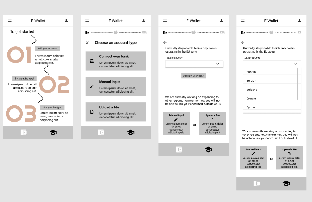
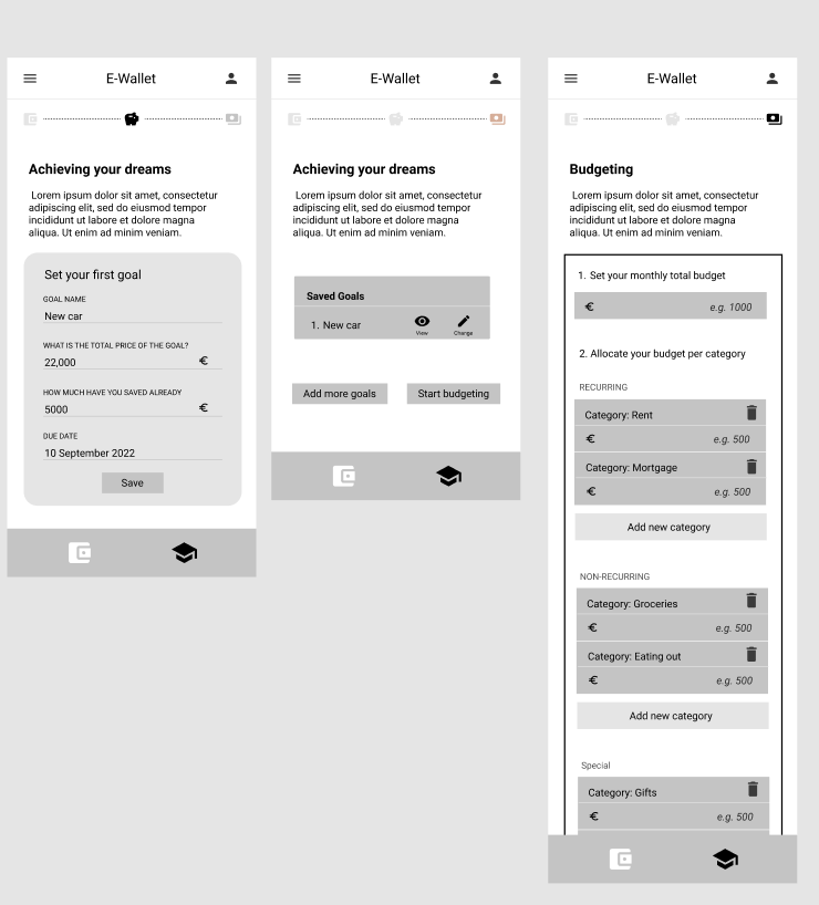
After the initial paper wireframes, it was time to create simple digital ones and start testing the assumptions with the users.
In line with the 'time' pain point identified, I have prepared digital wireframes based on the assumption that connecting bank accounts to the app would be preferred by the users as it would save significant amount of time for them.

In this phase of ideation, I have initally conceived to have the app equally distributed between the learning and the finance sections. The educational part allowed users to auto-determine their level of financial know-how and susequently select topics to learn more about.
For the finance part, the idea was to base the app on the principle of zero-based budgeting, with the ability to customize the categories as per user's liking.


